
Dell Technologies is a global technology company that designs, develops, manufactures, markets, sells, and supports computers and related products and services. Dell Technologies is one of the largest tech companies in the world, with over 165,000 employees across the globe. Dell Technologies was founded by Michael Dell in 1984, when it was known as PC’s Limited. Dell serves corporate businesses, government, educational institutions, law enforcement agencies, healthcare organizations, and small and medium-sized businesses.

Dell Technologies, a global leader in computing and technology, sought to enhance its data analysis capabilities through a tailored data visualization platform. With a workforce exceeding 100,000 employees and a diverse clientele, Dell needed a solution capable of handling large-scale data intricacies while providing intuitive tools for exploration.
Their vision included dynamic charts like Dognut, Bar, Radial, Geographical Map, and Trends, aiming to deliver real-time insights for informed decision-making. Additionally, customizable filters were crucial for streamlining data exploration and ensuring a seamless user experience.
Our task was to not only meet these requirements but also exceed expectations, aligning perfectly with Dell’s mission to lead in technological innovation.
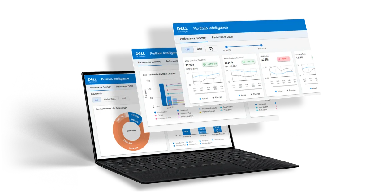
We started a project from scratch, building over six modules that included charts like Dognut, Bar, Radial, Geographical Map, and Trends. Our focus was on making these charts dynamic, so we integrated APIs to bind real-time data based on our client’s needs. Each chart also got multiple filters for a more interactive user experience.
Our team’s proficiency in handling data intricacies came through in the thoughtful design of these filters, making data exploration smooth and user-friendly. The project was all about delivering more than just charts – we aimed for a fully tailored data visualization solution that perfectly matched what our client envisioned.
In summary, our work involved creating diverse and dynamic charts, integrating APIs for real-time data, and adding user-friendly filters for a more interactive experience. The end goal was a customized data visualization solution that precisely met our client’s requirements.
This project with Dell Technologies epitomizes the fusion of technical expertise and client-specific needs, resulting in a state-of-the-art data visualization platform. By crafting dynamic, interactive charts and integrating real-time data, we’ve significantly enhanced Dell’s data analysis capabilities. The intuitive filters and engaging design elements ensure that the platform is not only highly functional but also user-friendly. This endeavor underscores our commitment to delivering customized, impactful solutions that drive informed decision-making and solidify Dell’s standing in the technology sector.